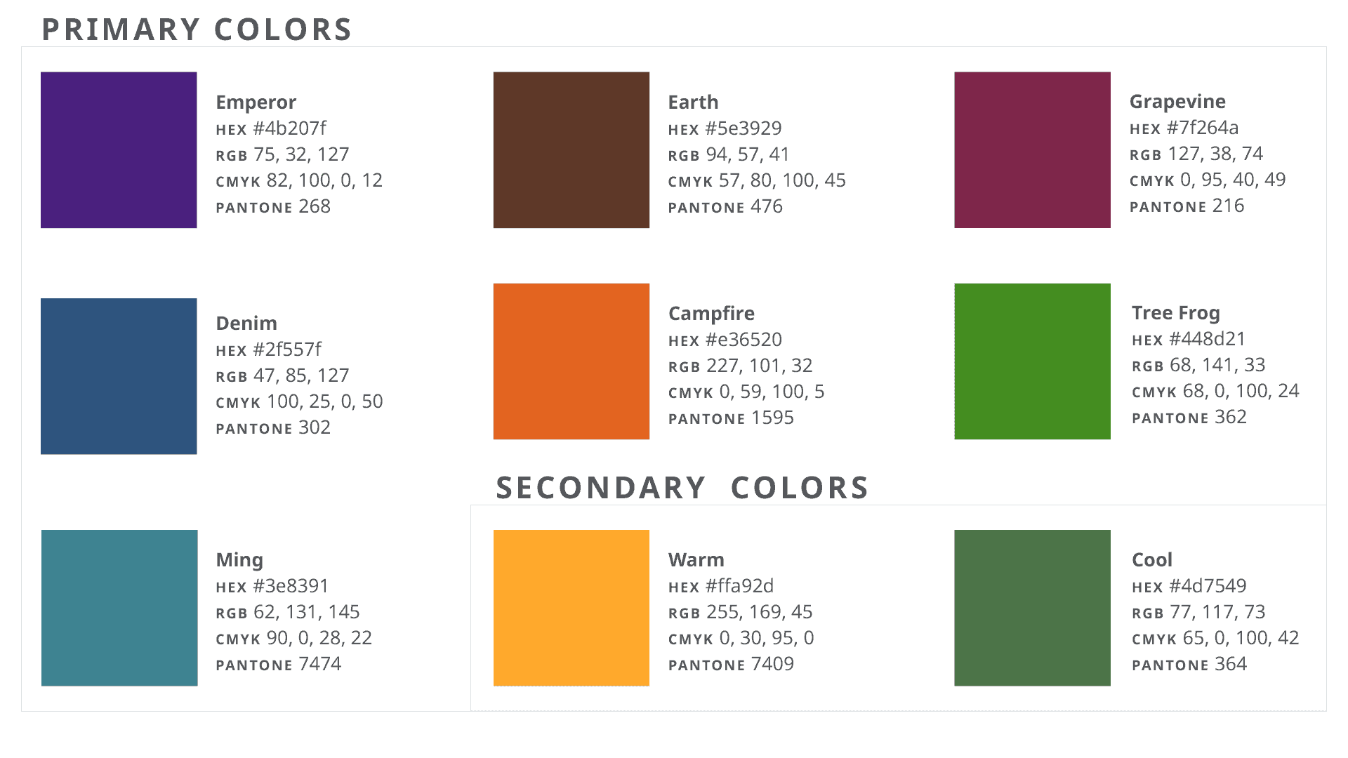
Because color means different things across the world, there is no official global color or color system. Where it seems valuable to create internal or regional consistency for missional purposes, world divisions are encouraged to create carefully thought-out systems that work to differentiate their materials within their individual contexts.
Recommended regional color systems will therefore be determined by local world divisions, and will be visible on this site as they become available. In the meantime, please contact your communication department for guidance.
If your division has not yet provided a color system, the recommended base palette is built upon the work done for ALPS, which can be viewed here.

Within this new, variable color system, the symbol can be adapted to match or compliment other layout elements, provided the symbol always remain a single, solid color. It is recommended that the Sabbath column be used as an area for tasteful color usage. If using the symbol over a color in the Sabbath column it should appear in white.